
My Brand / 2025-2026
For my brand, I wanted to clarify my goals, audience, competitors, and the distinct personality I wanted it to convey. I then carried out market and industry research to identify relevant visual trends, uncover opportunities, and refine positioning so my brand could genuinely stand out. I explored many variations and iterations of my logo, experimenting with form, color, and type, before I finally landed on the one I currently use.
A good logo feels familiar and unique

Version 1
I initially planned to pursue a more grunge, painted aesthetic. Ultimately, I decided to abandon that route in favor of a cleaner, more legible, and contemporary approach.
Here, you can see where I begin incorporating elements of the final logo into the initial design, refining shapes and proportions. However, I still wanted a modern, legible sans-serif typeface that reads cleanly at any size and complements the overall mark.
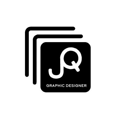
Version 2

In this version, I captured the overall direction I want my brand’s typography to take. I still found it a bit cluttered, which ultimately prompted me to refine and develop the final version.
Version 3
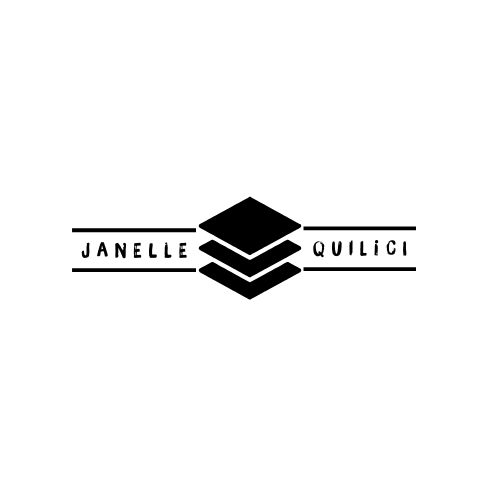
I combined the type from version 3, the icon from version 2, and the subtitle from version 1 to create version 4. It’s easy to read, visually balanced, and clearly communicates that I’m a graphic designer.